Forms: Service Forms
How to get there: Admin | Forms | Service Forms
Default Service Forms Search View
When Admin | Forms | Service Forms is opened, you will be presented with the following screen from which you can search for existing Forms, view an existing Form or add a new Form:
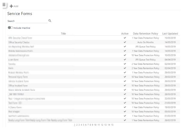
To undertake a search for a specific form that already exists:
-
Enter either a Title of a form to search on
-
Choose whether or not to Include Inactive forms
-
Select the magnifying glass to browse results. If there are lot of results that do not fit on the page, using the page numbers at the bottom of the page, select the different pages to scroll through the results. Alternatively, use a more specific search criteria
Screen Layout and Fields
|
Title |
The Title of the Form |
|
Active |
Indicates whether the Form is Active i.e. available for use, or inactive, that is, not available for use elsewhere in Timegate |
|
Data Retention Policy |
The Data Retention Policy is selected, when setting up forms from a drop-down list populated with entries that were created in Admin | System | System Settings | Data Retention Policy. The policy assigned to the Form is displayed in this column |
|
Last Updated |
The date that the Form was Last Updated |
Screen Actions
|
Add |
Add a new Form |
|
Search |
Enter a search term and selectto search for the Form of your choice |
|
Include Inactive |
Select if you wish to search for both active and inactive Forms |
|
Form items |
Select a Form item to view/edit it |
|
Numbers at bottom of Forms list |
Select a number to navigate through the pages of different Forms (more numbers are displayed as more pages of Forms are created) |
Service Forms Add/Edit/View Form Screen
The following screen shot illustrates the six various components of the Form Design screen. Each part of the screen will be independently detailed. Once described, you will learn how to develop, preview and then publish a Form using the Questions and Data Retention Policy that you have previously developed (See Forms: Questions). The screen components are as follows:
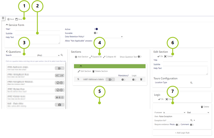
-
Service Forms Toolbar
-
Form (Form Details)
-
Questions (Form Question Selector)
-
Sections (Form Sections)
-
Sub-sections (when added)
-
Edit Section (Section Details)
-
Logic (Logic for exceptions)
Service Forms Toolbar
The Service Forms Toolbar enables you to complete a series of tasks relating to developing, previewing and publishing your form. Prior to the first time that the Form is saved, only the Back and Save options are available to select. Once saved, the following options are available:
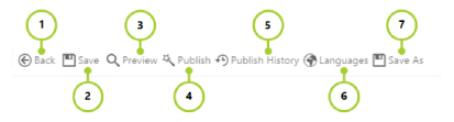
|
No |
Name |
Description |
|---|---|---|
| 1 |
Back |
Select to return back to the Admin | Forms | Service Forms Find Forms Screen. If Save has not been selected, any changes to the Form will not be saved. |
| 2 |
Save |
Save your Form |
|
3 |
Preview |
Preview your Form (opens another window - see Preview Form section below) |
|
4 |
Publish |
Publish your Form (see Publish Form below) |
|
5 |
Publish History
|
See your Form’s Publish History (see Publish History below) |
|
6 |
Languages |
Change language (if you are creating your Form’s in multiple language versions) |
| 7 |
Save As |
Save your Form with another name, using it, like a template as a starting point for a new Form |
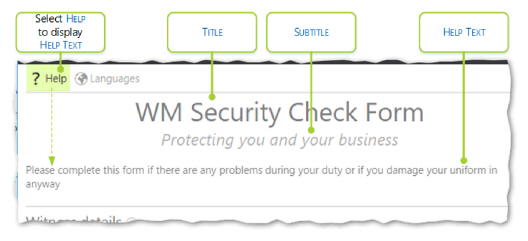
Form (Form Details)
Screen Layout and Fields
The Form part of the screen shows the general form information including details as of to whether the form is active and how long the data collected via the form will be retained:
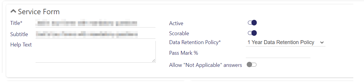
|
Title |
The title of the Form |
|
Subtitle |
The subtitle from the Form |
|
Help Text |
The support text associated with the Form. This is displayed when is selected from within the Form |
|
Active |
Indicates whether the Form is active i.e. available for use, or inactive, that is, not available for use elsewhere in Timegate |
|
Scorable |
Select if you wish for the answers to the questions in the form to be scored (this will show a Pass Mark % option within the Service Form part of the screen, and for each Section and each Scorable Question within a given Section you can add a weighting (Weight?)in the Sections part of the screen) |
|
Data Retention Policy |
The Data Retention Policy is selected from a drop-down list populated with entries that were created in Admin | System | System Settings | Data Retention Policy. This value governs how long data is stored that is collected from this table. See System: Forms for further information. |
|
Pass Mark % |
Only visible for update when Scorable is selected. Percentage at which the form score is considered a pass. Any value below this is value is considered a failure |
|
Allow "Not Applicable" answers |
If you wish to enable those completing the form to say a question is not applicable, select Allow "Not Applicable" answers.In scorable forms, the answer "Not Applicable" will not have an impact on the overall form score. In those forms where scores are calculated and displayed if all questions are answered with Not Applicable, N/A is shown for Score and blank for Pass |
The values entered when creating a Form are displayed as follows, when it is published:
Questions (Form Question Selector)
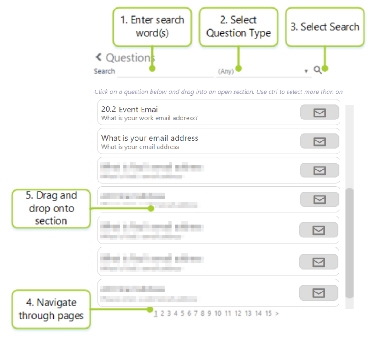
The Questions part of the screen shows the various Questions that are available to drag and drop into the Sections part of the Form design screen. There is also a search option to help you find questions if you have created many. These questions are those that are created in Admin | Forms | Questions. The following is an example of the Questions part of the screen, populated with a variety of question types:
-
To search for a question follow the steps outlined above - use the scroll bar to navigate through the screen view as required
-
Enter the term that you wish to Search for. This can be a partial word, a word or a series of words
-
Select the type Types or leave as (Any)
-
Select Magnifying Glass
-
Use the numbers at the bottom of the page to navigate through multiple pages of results
-
When you have found the question that you are looking for you can drag and drop it onto Section
Each question has a type icon next to it, to enable you to see what kind of question it is. The twelve types and their associated icons are as follows: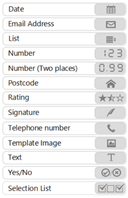
Sections (Form Sections)
Screen Layout and Fields
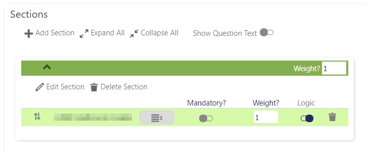
The Sections part of the screen shows the different Sections (or groupings) of questions that are on the form. From this screen, you create the Sections, drag then drop the Questions that you wish to add from the Question part of the screen to the Sections part, and then re-arrange the Questions as required. You can also select whether Questions are mandatory or optional when they are in their Sections. Within each Section, a Weight? can be attributed to Scorable Questions as well as to the whole Section.
Note: When setting up Forms, a Question can only be used once per Section. It can be used again, however, in another different Section, within the same Form:
|
Section title/Header |
Select a Section title/Header to expand or collapse the Section - expand to view the contents and edit the behaviors of the questions/delete the questions it holds. Additionally, when it is collapsed, it’s order compared to other Sections can be changed using the that appear in its Section title |
|
Question Name/Text and type |
Depending on what is selected for you will be presented with either the Question Name or Question Text and it’s type (shown as an icon) |
|
Location pointer (in section name) |
When rolled over, this shows which location on a tour the section is assigned to |
Screen Actions
|
Add Section |
Select to add in a new Section within your form |
|
Expand All |
Select to expand all Sections within your form |
|
Collapse All |
Select to collapse all Sections within your form |
|
Show Question Text |
Rather than show the name of a question e.g. WM Name, when this option is enabled, the full question is shown e.g. What is your full name?
|
|
Weight? (Section) |
Weight attributed to the whole section in comparison to other questions when scoring |
|
Delete Section |
Select this option to remove the section within your Form |
|
Edit Section |
Select this option to edit the section within your Form (See the next section for the details of the Edit Sections part of the screen) |
|
Up/Down Arrow |
Drag-and-drop the question up and down the list of questions to reprise |
|
Mandatory |
Select to make it mandatory for the user to select an answer to the question. Alternatively, leave unselected to make questions optional |
| Logic |
Selection is available for either List, Selection List, Rating and Yes/No type questions. Select if you wish to add exception logic (see Logic screen below) |
|
Weight? (Question) |
Weight next to a question assigns a weighting to the question compared to other questions within the section |
|
Delete Question |
Select to delete the question that the delete icon is aligned to |
|
Search icon |
Select to delete the question from within that section of your Form |
Edit Section (Section Details)
Screen Layout and Fields
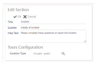
The Edit Sections part of the screen is designed for making changes to the Section that you are working on. From there you can enter/edit the Title, Subtitle and Help Text associated with a Section:
|
Title |
An appropriate title for the section that will be displayed in the Section Title/Header |
|
Subtitle |
The subtitle for the section, shown directly under the section heading |
|
Help Text |
The detailed help for the section that is displayed under the Subtitle when i is selected |
|
Location Type |
Using the Magnifying Glass select a location where you want the section to be shown when on a tour. If a value is not selected, the section will always be displayed. This only impacts Tours. If you use this form on an incident, all sections of the form will be shown. |
Logic Section
| If answer | Boolean logic selector, determined by the type of question | ||||||||||
| Exception list |
The name of the list being used to provide a mandatory answer to the exception question. The list can be a standard list (where the user will need to provide a single answer) or a selection list (where they have the option to select multiple answers). The choices available are as follows, depending upon the original question type:
|
||||||||||
| Require evidence - Photo | Select if you wish for the user to provide a photographic image to support their exception answer | ||||||||||
| Require evidence - Comment | Select if you wish for the user to provide a textural comment to support their exception answer |
Screen Actions
|
OK |
Select OK to save your changes |
|
Cancel |
Select Cancel to revert back to previous settings (i.e. without saving) |
Preview Form
Overall Form Preview
To preview a Form, select Preview Form. Ensure that you have saved your form (select Save) before you do this. If you do not save the Form, at best you won’t see all of your changes you’ve made. At worst, you may lose all of your work. The following is an example of a Form being previewed in the Preview Form screen. The screen loads up into a new window. Once you have previewed your Form, you can re-edit it or publish it. You can test how the screen will interact with your user e.g. you can fill in values and look at how the help is shown etc.
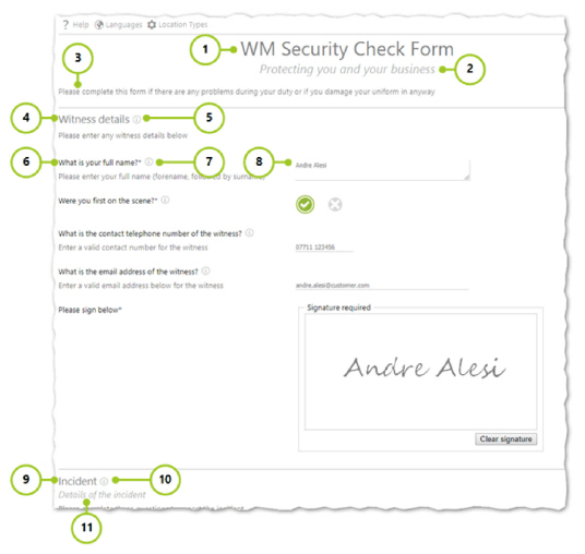
-
Form Section - Title
-
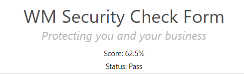
Form Section - Subtitle. If you have selected for a form to be scorable, the Score (as a percentage) and Status (e.g. Pass / Fail) is shown under this Subtitle as shown in the example:
-
Form Section - Help Text
-
Sections - First Section - Edit Section - Title
-
Sections - First Section - Edit Section - Help Text
-
Sections - Assigned question. Configured in Questions - Question Text
-
Sections - Assigned question. Configured in Questions - Help Text
-
Sections - Assigned question. Configured in Questions - Type (size of box is configured using Minimum Length and Maximum Length)
-
Sections - Second Section - Edit Section - Title
-
Sections - Second Section - Edit Section - Help Text
-
Sections - Second Section - Edit Section - Subtitle
Location Types
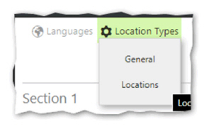
If you have selected Location Types for various sections of your form, you are able to use the drop down Location Type menu button to see how the form looks in each of the different Location Types selected.
Preview of different questions
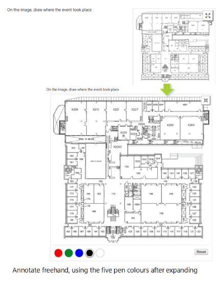
The following are examples of how the question types look in Timegate on a desktop browser (rather than a mobile phone) when they are added to a form.
Note: These questions may look different from browser to browser. It is likely that they will look significantly different on a mobile/tablet screen compared to a desktop computer screen. Form rendering, will respond to the size of the device. In the case of the Employee App, it will display forms differently as it uses a different rendering engine/process flow.
Note: Any item with an i next to it has additional help information associated with it. Select the i to access the additional information. Items with an asterisk (*) next to them are mandatory.
Date

Email Address

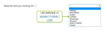
List
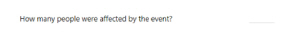
Number
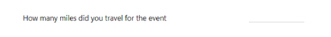
Number (Two places)
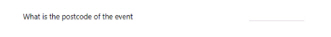
Postcode
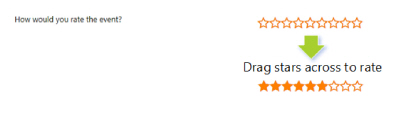
Rating
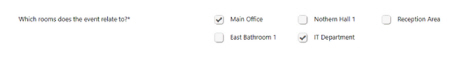
Selection List
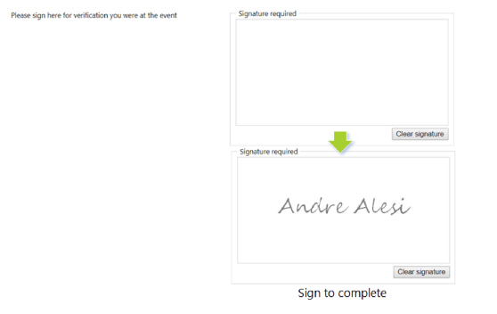
Signature
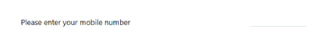
Telephone number
Template Image
Text
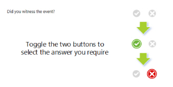
Yes/No
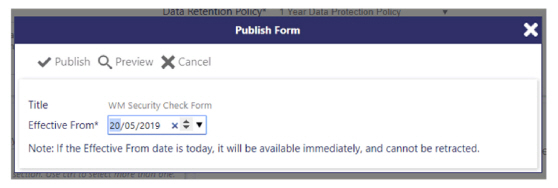
Publish Form
When you are happy with the way that your Form looks, you can publish it. Remember, it is key to understand that when you have published a form, it is published. It doesn’t change. To change a form, you must publish a new version. Therefore, make sure you thoroughly check your form to make sure it works how you want and that there are no mistakes within it. Once published, the form is eligible (from the effective date) to be rolled out for live usage. To publish a completed, checked Form, select Publish. The following will be shown:
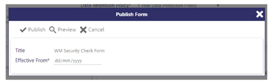
Select an Effective From date in the dd/mm/yyyy format, using the drop-down selector.
Note: If you enter today’s date, the following message will be displayed, warning you that it will be available immediately, and it cannot be retracted as shown in the following screen shot:
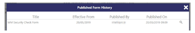
Select Publish. The Published Form History screen is launched, confirming the publication details:
Alternatively, you can select Preview to Preview your form or Cancel to go back to the Design page
Publish History
Screen Layout and Fields
When selecting Publish History, the Published Form History screen is loaded. This screen contains a record of all of the versions of the Form that have been published as follows:
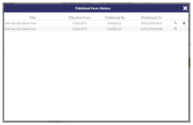
|
Title |
The title for the Form |
|
Effective From |
Date that the form becomes live in the system for use on forms |
|
Published By |
Name of the user who has published the form |
|
Published On |
Date that the request to publish was made |
Screen Actions
|
Magnifying glass |
View the given instance of the form |
|
Delete / trash can |
If the form has not yet become effective i.e. the Effective From date is a date in the future, you can select to delete the published version |
Creating, previewing and publishing a form Step-by-Step
To design, create, preview and publish a Form, follow these steps:
Firstly, write a list of questions that you wish to be included in the form. Decide how you are going to separate your questions into separate, inter-related Sections. Remember, planning is key to success!
For each question consider their Specific Type e.g. Date, Email address, List etc.
For any question that has a Specific Type of List,
-
Select Add
-
Enter a Name for the List
-
Enter a Description for the List
-
Select Active so that the List can be seen and used when creating questions
-
Select Add to add new Choices for the List
-
Enter a Choice (a value that will be in the List)
-
Repeat steps 5 through 6 until all required values (and as applicable points) are in list
-
Select Save to ensure that your changes are stored
For any question that has a Specific Type of Template image, create the template image from Admin | Forms | Template Image:
-
Select Add
-
Enter a Name for the Image Template
-
Select Active so that the Image Template can be seen and used when creating questions
-
Drag in the image that you wish to upload. This can be from a file stored for example, in Windows File Manager, or on your desktop, or from the Internet via your web-browser
-
Select Save
Now you have any Lists or Image Templates created, it is time to create your questions from Admin | Forms | Questions:
-
Select Add
-
Select the Type of question you wish to create
-
Enter a Name for the question
-
Enter the Question Text i.e. the question
-
Enter any Help Text
-
Select for this question to be Active
-
Complete any values associated with the Type that you selected in Step 17
-
Select Save
-
Repeat for each of your questions
Having created all of your questions, they can be consolidated into a form. From Admin | Forms | Service Forms:
-
Select Add
-
Enter the Form details
-
Enter the Title
-
Enter the Subtitle
-
Enter any Help Text
-
Select for this form to be Active
-
Select a Data Retention Policy (this will have been configured by your administrator in Admin | System | System Settings | Data Retention Policy
-
If you are scoring the form and you wish for there to be a pass/fail percentage mark, enter the Pass Mark % next)
-
-
Having entered the Form details, it’s now time to create your Sections:
-
Select Add Section
-
Enter Title
-
Enter a Weight for the section
-
Enter Subtitle
-
Enter Help Text for Section
-
Select OK
-
Repeat these steps for each Section you wish to create
-
-
Drag then drop the Questions that you wish to add from the Question part of the screen to the appropriate Sections part
-
Re-arrange the Questions as required (using the up and down arrows as necessary)
-
For each Questions, select whether or not it is Mandatory
-
For each Questions, select whether or not you wish to apply an exception to the response (Logic). When completing a form, this functionality enables you to give the user a prompt to enter their reason for the answer that they have given using a drop-down list and optional provide further textural or photographic evidence to support their response
For each question where Logic has been selected, it must be configured within the Logic details fo the individual questions
-
Configure the boolean logic (e.g. If the answer is No) using the drop-down lists. These choices vary depending upon they type of question logic is being applied to
-
Select the Exception list (i.e. the list of options presented to the user in response to their initial answer)
-
Select whether you wish for Photo evidence and/or a Comment to be entered when giving a response
-
Select OK
Now that your Form is completed, select Preview to look at it. If you are happy with the results, continue to the next step in this process. Alternatively re-edit your form and questions etc., using the details above
-
Select Publish:
-
Select an Effective From date
-
Select Publish. You are all complete now - close the window to return