Analyze: Dashboards - Auto vs Manual Calls
Note: This content is applicable to the legacy web version of Timegate.
How to get there: Analyze | Dashboards | Auto vs Manual Calls Dashboard
This section gives an overview of the Auto vs Manual Dashboard. It organizes and presents information in a way that is easy to read and refine onscreen. Live data is gathered from all over the system before being combined and presented for the audience in an appropriate format.
This Analyze Auto Vs Manual Calls Dashboard displays Duty Call history, showing calls that were taken automatically compared to those being manually taken.
The screen is logically broken down into three sections - Dashboard Filters, Auto Calls Dashboard Control and Percentage of Calls Automatically Taken as shown below:
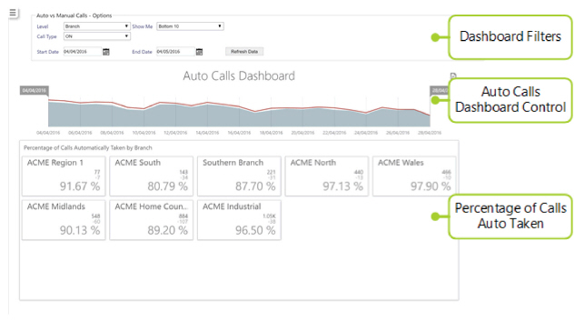
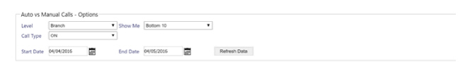
Dashboard Filters
Screen Layout and Fields
|
Level |
Drop-down list allowing the user to build the dashboard by branch, holiday manager, payroll run and absence scheme (Branch, Customer, Call Monitor View, Site Group, Site Card or Employee) |
|
Show Me |
Select the type of calls to be displayed based on whether or not they are the top performing entities. The value is to be selected from the drop-down list (Top 5, Top 10, Top 20, Bottom 5, Bottom 10 or Bottom 20) |
|
Call Type |
Select the type of call from the drop-down list (All, On, Off or Check) |
|
Start Date |
Using the pop-up calendar, select the start date for the data to be analyzed in the dashboard |
|
End Date |
Using the pop-up calendar, select the end date for the data to be analyzed in the dashboard. Any valid date can be selected (it must be the same or later than the start date) |
Screen Actions
|
Refresh Data |
Update the view based on the values entered into the dashboard filter |
Auto Calls Dashboard Control
Screen Layout
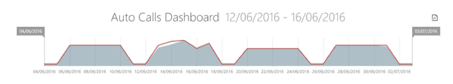
Below the filter section, there is a graph that gives an indication of the number of expected calls. This is represented by a red line. Additionally shown on the graph are the number of calls actually taken (represented by a shaded gray area below the red line).
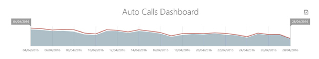
A gap between the calls expected red line and the shaded gray area indicates that expected calls have not been taken as shown:
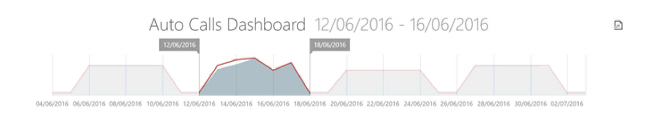
The dates can be dynamically amended by moving sliders within the graph:
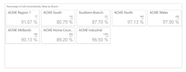
Percentage of Calls Automatically Taken
The section below the graph shows a breakdown of the calls for each entity (branch, site, site group etc. based on the level chosen in the option filters), for the date range highlighted in the graph section. Depending upon the option chosen from the Show Me Filter, this will show a given number of bottom or top performing entities. In the example below, there is a tile for each entity, the number of calls taken by the system, the number not taken automatically and the percentage of calls taken automatically by the system.
Screen Layout