Engagement: Employee Portal: Theme
How to get there: Admin | Engagement | Theme
The look and feel of the Employee Portal can be changed to match with a company’s corporate branding. Some clients may run different trading names or branded services from one system, making it important that their employees can see the branding of the company that they work for. From within Portal Themes, branding is defined for Business Units.
see Setup | Business Unit for more information.
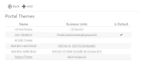
On opening this part of the system, a summary of the existing themes are shown. Either an additional new theme can be added, by clicking on the Add button, or an existing theme can be edited by clicking on its respective row.
Screen Layout and Fields
|
Name |
Name of the theme given to identify it |
|
Business Units |
The names of the Business Units that will use the theme |
|
Is Default |
When ticked, this indicates that the theme will be used by default where a Business Unit has not been defined within the Employee Portal URL |
Screen Actions
|
Back |
Return to previous page |
|
Add |
Select Add at the top of the screen to create a new theme |
|
Row |
Select a row if you wish to view/edit an existing theme |
Add or Edit a Portal Theme
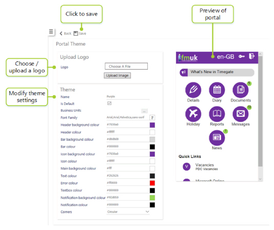
By clicking either option, a screen will be shown that will allow the maintenance of the Portal Theme.
The screen is split into two areas. The settings are updated in the left hand side and a preview of the settings is shown
on the right.
Screen Layout and Fields
|
Choose a File |
Click to select a logo to use |
|
Upload Image |
Click to upload the selected image |
|
Name |
Name of the theme |
|
Is Default |
Indicates that the theme is used by default where no Business Unit is defined within the Employee Portal URL |
|
Business Units |
Press the [...] button to select the Business Units that will use the theme. A theme can also be selected from the Business Units screen and will also be shown here see Setup | Business Unit for more information |
|
Font Family |
Press the square button to select the Font Family to use from the list: 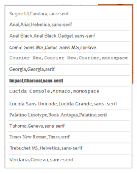
|
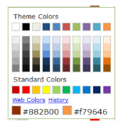
All of the following color options are available by entering the # code is the space provided, or by selecting the square color preview buttons to the right:
|
Header background color |
Top heading bar background color |
|
Header color |
Top heading bar text color |
|
Bar background color |
Announcement bar background color |
|
Bar color |
Announcement bar text color |
|
Icon background color |
Icon background color |
|
Icon color |
Icon text color |
|
Main background color |
Main background area color |
|
Text color |
Text color |
|
Error color |
Error message text color |
|
Textbox color |
Text field color |
|
Notification background color |
New item notification background color |
|
Notification color |
New item notification text color |
|
Corners |
Drop-down list of Square, Rounded or Circular icon shape |
Screen Actions
|
Back |
Return to the theme summary |
|
Save |
Save any changes |
|
Delete |
Delete theme |